


From Woodstock to the Web: A User-Centric Redesign
The challenge for this project was a sense of disconnect. The existing website failed to reflect John's rich legacy and brand, rendering it unrecognizable to fans. The original website also failed to meet any guidelines set out by WCAG 2.1 for accessibility standards. These issues were particularly problematic when affecting areas such as navigation and e-commerce.
This case study explores the process of ideating, designing, testing and implementing a new website for John Fogerty, with special attention given to creating branding cohesion across social media as well.
Background:
Who is John Fogerty?
John Fogerty is a Rock and Roll Hall of Fame inductee, a Grammy winner, and the singer songwriter for legendary songs like Centerfield, Have You Ever Seen The Rain and Proud Mary.
His fan base, accrued over 50 years of touring has aged with him, but his website has remained stuck in the past, the product was outdated, uninviting, and difficult to read. What was so intriguing to me about this product was despite how battered it was, the site boasted large, even devoted numbers of daily site users. This was backed by early user research conducted with John's most devoted fans; several confirmed that John's website is their only source for tour dates, and news, eschewing social media entirely.
Product Exploration
Understanding Artist & User Needs
As a starting point for revitalizing the product, I collaborated with John and his manger to identify known pain points with fans and the digital brand:
Misalignment with Fan Expectations: The website often falls short of meeting the expectations of both long-standing and new fans, impacting fan satisfaction, sales and engagement levels. The site also fails to align with John's far more robust social media platforms.
Brand Identity: The website has little to no brand identity, relying solely on a single recurring image of John to reinforce the product. Additionally, it fails to connect the Fogerty brand to the CCR brand, resulting in fewer John listeners and a smaller pool of name recognition.
Fragmented Fan Knowledge: Companies and individuals involved in managing John's online presence lack direct user insight into brand identity, preferences and user feedback, making it difficult to meet user expectations.
Defining Deliverables
To resolve these concerns, we create a comprehensive digital plan :
Enhanced User Experience: Improve the overall user experience by creating an intuitive, user-friendly website that appeals to John's diverse fan base.
A Desktop-First Focus: Early data and conversations with Management reinforced the desire for a desktop first experience. Users who expressed they rely solely on the website for updates were far more likely to access the site from a computer than a smartphone.
Aesthetic Enhancement: Elevate the website's visual appeal and aesthetics to better align with social media presence and John's existing brand as seen on albums and merchandise.
Streamlined Navigation: Implement a streamlined navigation system that allows users to find information quickly and efficiently, reducing the time it takes to access desired content.
Improved Visibility: Enhance the visibility of critical website elements, such as upcoming shows, merchandise, and John's music, to ensure users can easily access this information.
Improve name recognition: This will be a multi-platform effort to better tie the Fogerty brand to CCR, making it easier for fans to find John's solo discography and increasing the likelihood of buying merch and attending his tour.
The Solution
The goal is to establish a consistent online brand that celebrates the band as a whole and enables fans to connect better; this implementation will be completed in 3 phases:
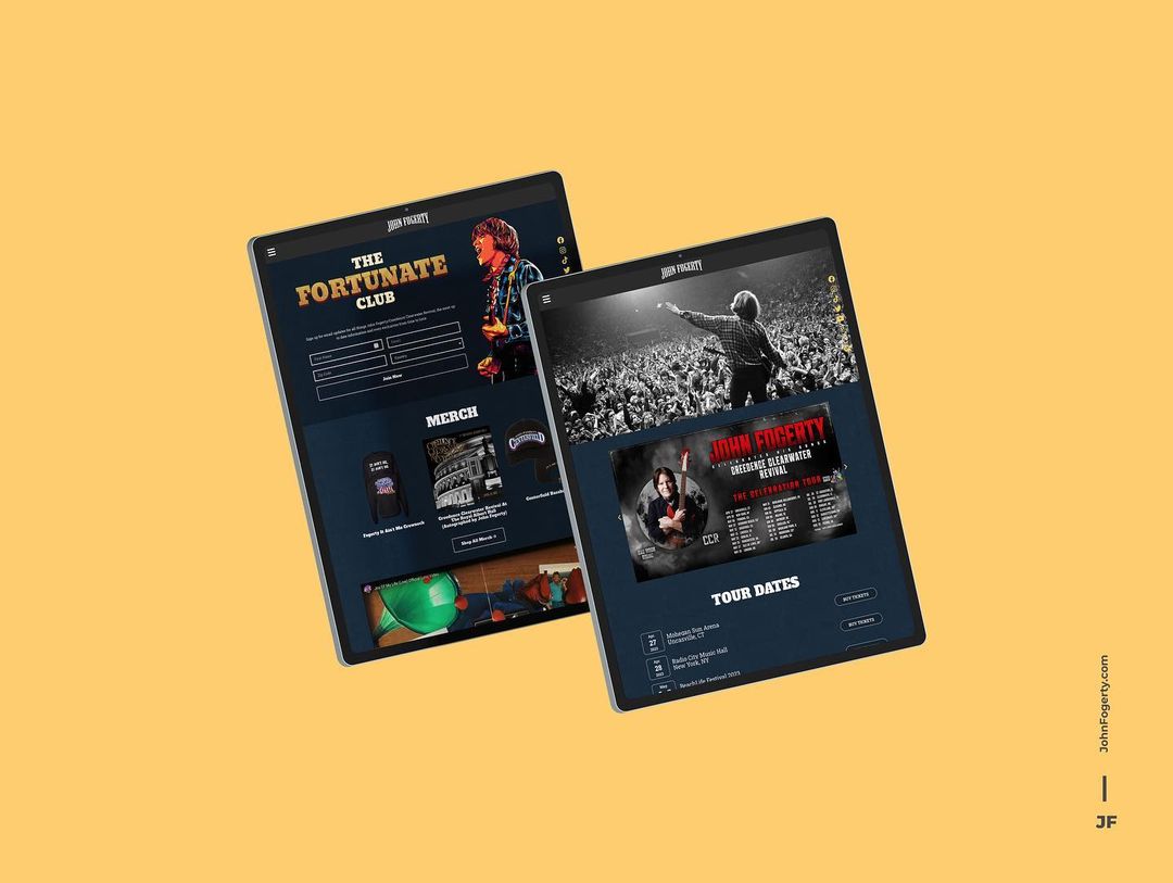
Launch Website: Utilizing a WordPress CMS for construction and administration ensures content simplicity and longevity while maintaining visual alignment with our existing social media aesthetic.
Establish a Cohesive Narrative: Cultivate a cohesive image centered on celebrating the band's music over history, while maintaining a tone of gratitude and joy.
Launch Shop: Due to Legal's need to broker a shareholder agreement, this will be the focus of a later iteration, which will develop a platform for fans to shop for music, clothing, and merchandise.
Research & Ideation
Research & Analysis
To better understand the direction of the website, I benchmarked John's website against those of other prominent artists in the music industry. This analysis unearthed glaring disparities in usability, engagement, and aesthetic appeal compared to many of John's peers. These insights were instrumental in highlighting the urgency of our impending redesign.
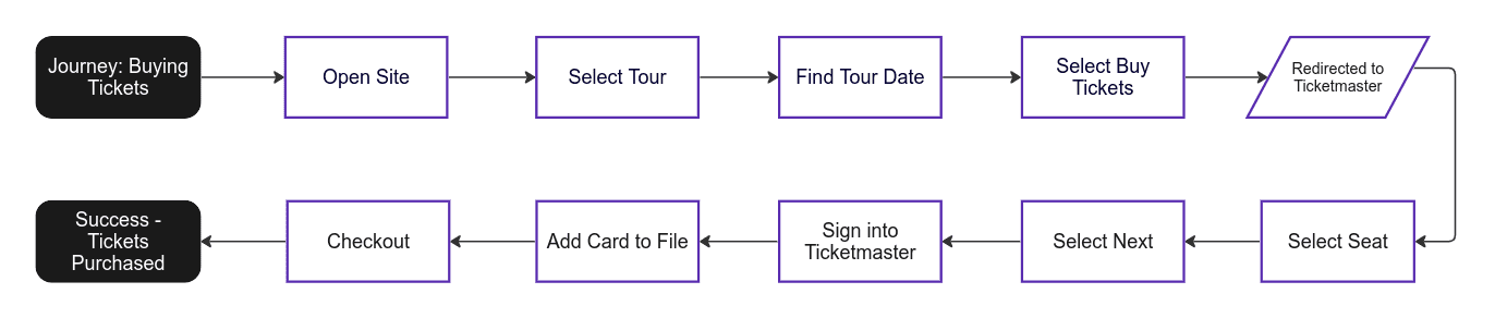
User Flow Mapping
To gain insights into our users' pain points and goals, I created linear user journey maps. This exercise allowed me to visually map out the entire user experience, from the initial discovery of the website to making a purchase or accessing exclusive content.

Design
Ideation and Early Prototype
Using data from our competitive analysis and the outlined brand goals, I created a mid-fidelity prototype to validate the information architecture, features and goals with users early to avoid unnecessary redesigns.


Recruiting Fans
Given the extensive improvements required for the website, I recognized the importance of gathering feedback efficiently while managing costs. We identified five key archetypes representing John Fogerty's diverse fan base, including Concert Goers, Social Media Sharers, Legacy Fans, Shoppers, and Lifelong Fans.
I recruited a diverse group of fans through referrals from artist management, social media platforms like TikTok and Instagram, and face-to-face contact at concerts.
User Testing
These hands-on sessions were conducted in two parts: user interviews to better understand user mindset and branding disconnect, and user testing, where users were asked to preform a series of tests on the live website and the new prototype.
Key Findings:
Validation of Website Hypothesis: Based on the feedback received during the interviews, it was clear that users were not satisfied with the current website. They highlighted several issues such as poor text readability, an outdated website look and feel, and a lack of branding and style. This indicates that the website does not align well with the Fogerty brand and fails to meet user expectations.
Disconnect Between Branding & Existing Site: Based on the style guides exercise, it became apparent that there is a lack of consistency between John Fogerty's branding as perceived by his fans and the branding that is currently present on his website. The majority of users ranked the existing style guide as the least likely to represent John's brand. This emphasizes the importance of a more cohesive and consistent brand representation in the new website design.
Positive Feedback on Prototype: The initial version of the prototype was met with overwhelmingly positive feedback from its users. They expressed relief that some of the issues present on the existing website, particularly readability, had been addressed.
Usability Testing Results
Below are a selection of user personas outlining key user feedback from their interview & usability sessions:


Designing the Solution
The feedback from usability testing prompted significant changes to the prototype. Enhancements included features like the Fortunate Club, a revamped emailed newsletter, and a dynamic timeline feature that fulfilled users' requests for more engaging content. Adjustments were made to the homepage elements, and future features were promised to maintain fan engagement.
Style Guide
To craft a meaningful style guide, I reviewed social media and album covers to better understand the existing visuals that make John's brand so meaningful. Every choice, from typography to texture, was carefully crafted to reflect the grit, working class, and Americana spirit that define John’s legacy.
Typography: Typography was chosen for its clarity and readability. The selected fonts were also intended to reflect the spirit of western blues, the inspiration for much of John's music.
Color: The lavish gold accents were picked in contrast to the deep blues reminiscent of classic denim, symbolizing American workwear. The colors evoke John's "It Ain't Me," message in Fortunate Son.
Texture: Utilizing fabric swatches from Vietnam War Jackets, and 70's denim, I created a weathered background that honored the authenticity and resilience in John's music.
Buttons & Navigation: Much like John's music, the button design aimed to offer a similar sense of approachability. This design choice encouraged users to explore the website.

Prototype
High Fidelity Protoype
Using all the data from user interviews, and the newly created style guide I created a high fidelity prototype for developers to build the product:
Development
The development phase marked a pivotal moment in the product. Once the prototype was approved by John and his Manager, it was passed along to Crowd Surf for development and implementation. I acted as an advisor, offering feedback and input as the product was built. Throughout the development process, the prototype was continually iterated as needed,
Measuring Success
Post-launch, our focus shifted to monitoring key performance indicators (KPIs). Metrics such as website traffic, user engagement, merchandise sales, and social media interactions. The results were nothing short of impressive, with improvements seen across the board. While full statistics are being omitted to protect the client, some key improvements included doubling the average time users spent on the site, noticeable growth to site traffic and higher sales conversions with fewer abandoned carts on merchandise.
Testing the Live Product
Fan-powered innovation! As part of post-launch testing, I went on tour with the Fogerty's to perform additional evaluation on the website. This allowed me to receive candid feedback and gain a deeper understanding of what e-commerce products to prioritize based on sales and fan preference.

37%
Increase in Merchandise Sales Post Launch
92%
of Surveyed Users Reported an Improved Web Experience
84%
of Survey Users Agreed the Site Was Easy to Use
“The new site is actually functional now and is fun to use! It finally has the look and quality I'd expect from an artist like John Fogerty. It just works.”

Sophia
Music Influencer, Journalism Student
Conclusion
Redesigning John's website was more than a visual update, it was about honoring a storied musical legacy while embracing modern digital expectations. By centering the design around user needs, we transformed a static, outdated platform into a dynamic, accessible, and engaging hub for fans across generations.
Through iterative user research, prototyping, and real-world testing, including invaluable feedback gathered during live tours, we ensured the site not only met but exceeded user expectations.