
Air Hoku: Full Transparency. Real Flexibility. Better Travel.
Air Hoku is a conceptual airline website reimagined to make flight booking to and around Hawaiʻi feel as easy and welcoming as the destination itself. Designed with a focus on flexibility, transparency, and user empowerment, Air Hoku addresses long-standing frustrations in the airline industry from unclear fees to rigid search flows, by centering clarity, control, and delight in every step of the booking journey.


Background:
The Journey Begins And Falls Apart
Imagine planning your dream trip to Hawaiʻi. Picture turquoise waters, volcanic landscapes, and island hopping adventures. Excitement builds as you start booking flights.
But then you hit the airline websites. Suddenly, the anticipation gives way to complexity. You're confronted with a maze of fare options, dates that require constant re-selection if you want to compare prices, and a persistent worry about hidden fees for bags or seats adding hundreds to your budget. You select dates, input passenger details, and then realize you need to adjust the return by one day.
You click back, and...everything resets. The frustration mounts. What should be an exciting step feels more like navigating a minefield, leaving you wondering if you missed something, paid too much, or simply wasted precious time.
Booking a flight shouldn't feel like a gamble. This case study explores Air Hoku, a conceptual airline designed to fundamentally rethink the flight booking experience for Hawaiʻi travel, prioritizing transparency, flexibility, and trust from the very first click.
The Broken Booking Experience
Despite flashy interfaces, most airline booking sites frustrate users with:
Rigid flows that penalize indecision and alteration.
Hidden pricing and late disclosure that feels dishonest.
Information Overload with large, unstructured content.
Product Goals
Design a flight booking experience that:
Engineers Superior Flow: Design an intuitive, flexible path that allows easy modifications without forcing users to restart.
Prioritizes Radical Transparency: Reveal booking costs up front and often throughout the process.
Creates A Simple, Joyful Experience: Adopt minimalist design and strong branding. Present essential information clearly to avoid competitor clutter and confusion.
Product Exploration
User Survey
To establish a baseline understanding, I completed an online survey with 50 potential users comprised of native Hawaiians, local residents and frequent travelers.

Customer Value Curve
To gain a deeper understanding of Air Hoku's competitive landscape, I conducted a comparative analysis against the established market leaders, Hawaiian Airlines and Delta Airlines, based on a survey sent out to users.
The survey revealed that Hawaiian holds a strong position in areas like Trust and Loyalty and Delta succeeds in their Loyalty Program and Comfort. Meanwhile, Air Hoku can have real market impact by prioritizing Usability, Flexibility, and Price/Value, and by delivering an exceptional Digital Experience.

User Interviews
I conducted semi-structured interviews and usability testing with 6 participants: 3 locals who travel inter-island at least quarterly and 3 mainland US residents who had visited Hawaiʻi multiple times. The goal of these sessions was to better understand the end-to-end booking experience, major pain points with existing airline sites (Hawaiian, Southwest, & Delta), product strength, and the ideal booking experience.
Key Findings:
Restart Penalty: Universal frustration with having to start over after minor changes to search criteria.
Fee Ambiguity: Strong distrust around hidden fees and how late costs are shared.
Cognitive Overload: Feeling overwhelmed by too many flights presented at once, unclear fare features and excessive upselling.
Disdain for Ancillary Booking: No users opted to utilize ancillary bookings like hotels and car rentals. Users felt that the airlines were upselling these services and were skeptical about getting a good deal through integrated booking.
Affinity Diagram
Synthesizing the interview data through an affinity diagram helped reveal recurring themes and prioritize user concerns. Clear patterns centered on the core booking experience itself. Users consistently highlighted the need for intuitive search functionality, straightforward seat and baggage selection, and more control over ancillary offerings.

Journey Mapping
I created a Customer Journey Map to visualize the user's experience from start to finish, charting the typical path from initial travel inspiration and planning through searching, booking, and ticket confirmation.
While people were generally excited during the early planning stages, significant friction arose during the core booking tasks. Users frequently reported feeling overwhelmed when comparing flight results and expressed frustration due to the lack of transparency surrounding fare tiers and hidden costs discovered while selecting flights and seats.

Competitive Benchmarking
I conducted competitive benchmarking, evaluating key players like Hawaiian Airlines and Delta Airlines through heuristic analysis combined with insights from user testing. This process helped identify prevailing industry standards, competitor strengths worth noting, and critical weaknesses that presented opportunities for Air Hoku. While competitors demonstrated many strengths like on-demand information, and a clean interface, user insight revealed significant shortcomings.
Users struggled with the rigid navigation flows and editing search results without starting over, a lack of transparency around final costs, and information overload leading to decision paralysis.
These pain points validate our goals and confirm the importance of prioritizing an intuitive, flexible booking path, upfront cost transparency, and a clean, simple design.
Design
User Flow Redesign
I designed a modular user flow focused on non-destructive editing. Key solutions included:
Editable Modules: Each search criteria (Dates, Flights, Passengers) is capable of being revisited and edited without losing data in other completed sections. The system warns users if edits impact subsequent steps, requiring confirmation before proceeding.
Simplified & Labeled Flight Results: To reduce decision freeze and promote quick decision-making, initial results display only the top 3 flights determined by its label. Labels were based on key factors identified in user research: best price, fastest travel time, and seat availability. Users can click the view more flights button to load full results.
Persistent Summary: The top navigation bar constantly displays current trip selections (dates, passengers, type), while a fixed progress stepper shows users their stage in the booking process, ensuring clarity and orientation.
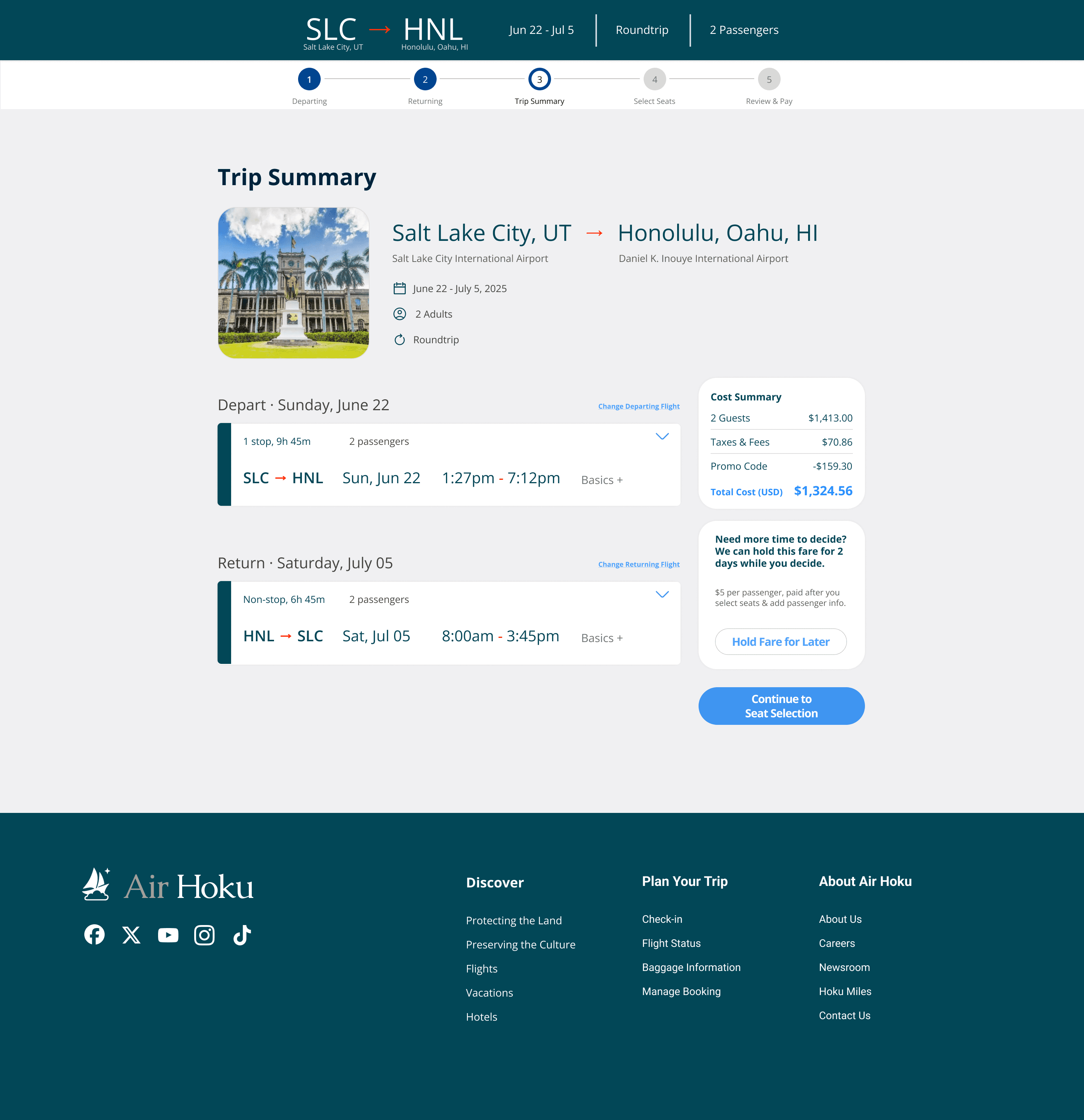
Transparent Cost: A clear cost summary is introduced early on the Trip Summary page. This summary then remains prominently displayed and dynamically updated during the review and payment process, ensuring users always have a clear understanding of the total cost and preventing the last-minute fee surprises often encountered with competitors.
Integrated Fare Calendar for Transparency: Allowing users to see price variations across dates before committing to a specific day, accessible directly from the date selection module.
Sketching & Wireframing
I started with low-fidelity sketches to explore layout options for booking screens focusing on information hierarchy and the placement of editable elements. This evolved into mid-fidelity wireframes using Figma.


Prototype
High Fidelity Prototype:
I translated the wireframes into a high-fidelity, interactive prototype incorporating a clean UI and a strong sense of branding drawing from the natural beauty of Hawai’i. I focused on designing and implementing the core differentiators & features for testing:
Key interactions prototyped included:
Editing search criteria at different stages of the booking.
Contextual onboarding modals designed to teach users how to make edits.
Selecting different departure and return dates, and seeing the corresponding daily fare previews update instantly.
Interacting with the visual seat selection map, including hovering over seats to view details.
Observing how the cost summary updates as selections like seats or potential ancillary items were made.


Usability Testing
I conducted moderated remote usability tests with 5 participants, including two returning testers from the initial test.
Methodology: Participants were asked to book a round trip flight from Salt Lake City to Honolulu for 2 adults, add one checked bag per person, and find the cheapest option within a 14-day window.
During booking, they were also tested for their ability to alter the search criteria at multiple points in the booking process. I observed their interactions, encouraged think-aloud protocol, and measured task success rates and time on task.
Key Findings & Iterations:
Delights: Users navigated the progressive disclosure of information effectively, significantly reducing decision time when selecting flights. The labeled flight categories were well-received and utilized, the fare calendar was also highly praised. Several users explicitly commented on the feeling of control and reduced anxiety compared to their typical flight booking experiences.
Minor Issues: Clarity around specific baggage weight limits needed improvement, a few larger font sized labels, and the distinction between fare types was refined based on feedback.
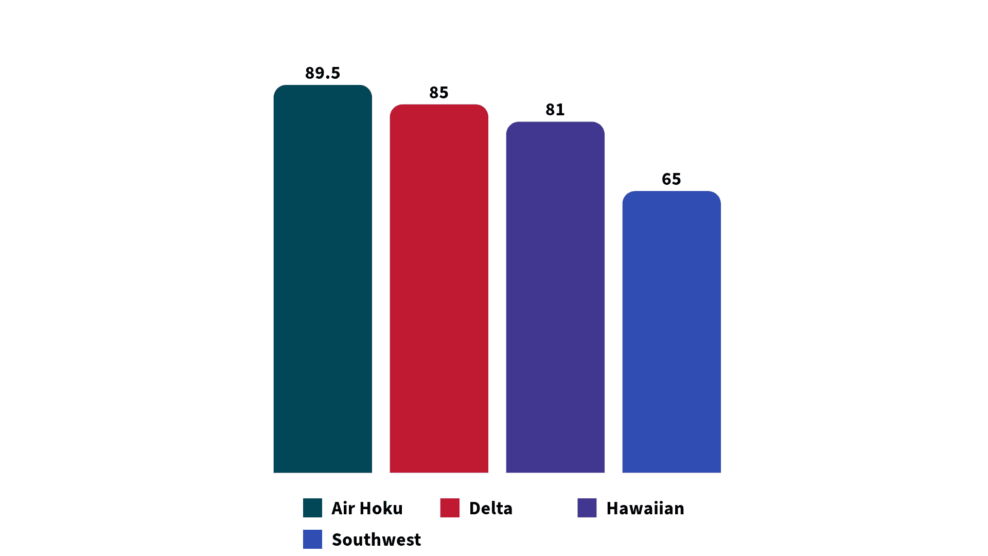
System Usability Scale (SUS):
After completing the tasks, participants filled out a SUS survey. Air Hoku achieved a cumulative SUS score of 89.5.
Significance: This score provides strong validation for the design direction and shows that the solutions addressing flexibility and transparency resonated powerfully with users.
Context: This result comes from a focused test group (n=5), and the enthusiasm also reflects the direct comparison users made between the prototype and the known industry pain points Air Hoku solves for. Observations also suggested frequent travelers particularly valued the improvements, contributing to the high satisfaction level.
Handover
To ensure the design vision was clearly communicated and accurately implemented, I created the Air Hoku Web Application Guide, a detailed handover document for developers and stakeholders. It outlines how the interface should behave, look, and respond across key user flows.
Annotated Screen Flows: High-fidelity mockups walk through each stage of the booking process, from the homepage and search to seat selection and confirmation. Numbered annotations explain key UI elements, content requirements, and interaction states.
Interaction Logic & System Response: Core interactions like expanding the search module, editing trips via the sticky nav bar, or using the dynamic fare calendar are paired with system responses, including error handling.
Component Behavior: Each interactive element includes specs for default values, hover states, selected feedback, and user preferences like remembered locations.


89.5
CSAT Score
4m 30s
Average Booking Time
100%
Task Completion Rate
“I appreciate having the freedom to quickly change plans; I wish every airline website worked like this.”

Michaela
Frequent Traveler, Communication Specialist
Conclusion & Pitch Deck
While Air Hoku remains a conceptual project, the user frustrations it tackles are persistent and widespread in the travel industry, and, as this project demonstrates, they are solvable. By maintaining a relentless focus on the core user needs for transparency and flexibility, the Air Hoku design offers a significantly improved and more user-respecting approach compared to many existing systems.
The success measured in testing wasn't just about a clean interface or smooth interactions, it was about how the experience made users feel: empowered, informed, and respected. By removing the fear of surprise fees and the friction of rigid processes, users could explore flight options with confidence, make changes easily, and start feeling excited about their trip well before they step foot in the airport.
Travel should start with excitement, not anxiety and Air Hoku is proof that design has the power to make that shift real.